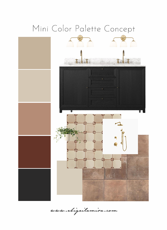
This bathroom design started the same way many of my favorite spaces do—with a color palette. Before fixtures, before tile layouts, before finishes, I wanted to explore how a small range of tones could work together to feel warm, grounded, and timeless without feeling heavy.
This mini color palette concept is all about contrast through restraint. Rather than relying on bold colors, the interest comes from layering soft neutrals with rich, darker anchors and warm metallic accents.
The Foundation: Soft, Earthy Neutrals
The lighter tones in this palette—warm beige, soft cream, and muted clay—create an easy, calming base. These shades are incredibly versatile and work beautifully in bathrooms because they reflect light without feeling cold. They set the stage for the rest of the design, allowing texture and material to do the heavy lifting.
Adding Depth with Contrast
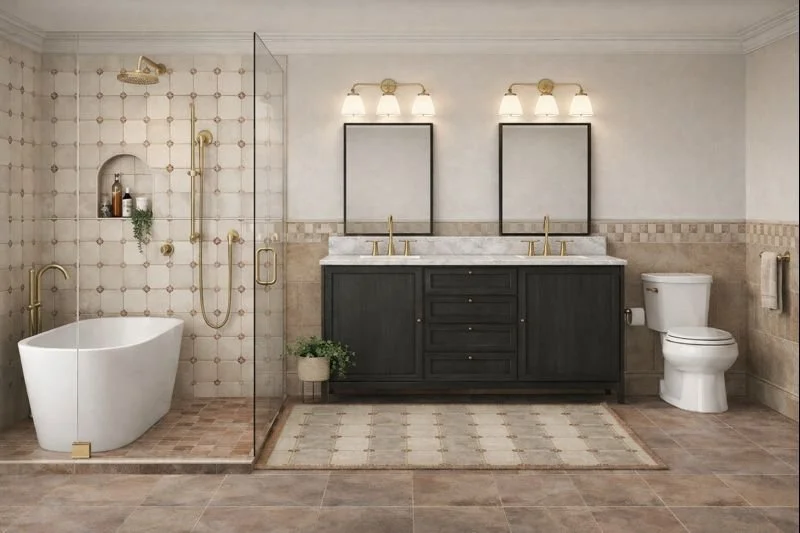
To keep the palette from feeling flat, I introduced deep charcoal and warm brown tones. The dark vanity acts as the visual anchor of the space, grounding the lighter elements around it. I love using darker cabinetry in bathrooms—it adds instant sophistication and makes the room feel intentional rather than builder-basic.
Paired with a marble countertop, the contrast feels elevated but still approachable. The subtle veining in the stone brings movement into the design without overwhelming the palette.
Texture Over Color
One of my favorite parts of this concept is how much texture is doing the work. The warm-toned tile introduces variation and depth, while the patterned surface adds just enough visual interest to keep the eye moving. When working with a tight color palette, texture becomes essential—it’s what keeps the space from feeling one-note.
Warm Metals to Finish the Look
Soft brass fixtures were the natural choice here. They bridge the gap between the warm neutrals and the darker elements, adding a gentle glow that feels timeless rather than trendy. In a palette like this, hardware and lighting become jewelry—they’re subtle, but they matter.
This palette could easily translate to other rooms—laundry rooms, powder baths, even kitchens—with just a few material swaps. It’s a reminder that you don’t need endless colors to create a layered, beautiful space. Thoughtful repetition and balance go much further. Sometimes, the most impactful designs are the ones that whisper instead of shout.
What Color palette would you like to see next? Let me know in the comments!

AI Rendering
Get The Look
Please note that this is not a sponsored post; some links may contain affiliate links. If you purchase through one of my links (at no additional cost to you), I may earn a small commission. Thank you so much for your support!
