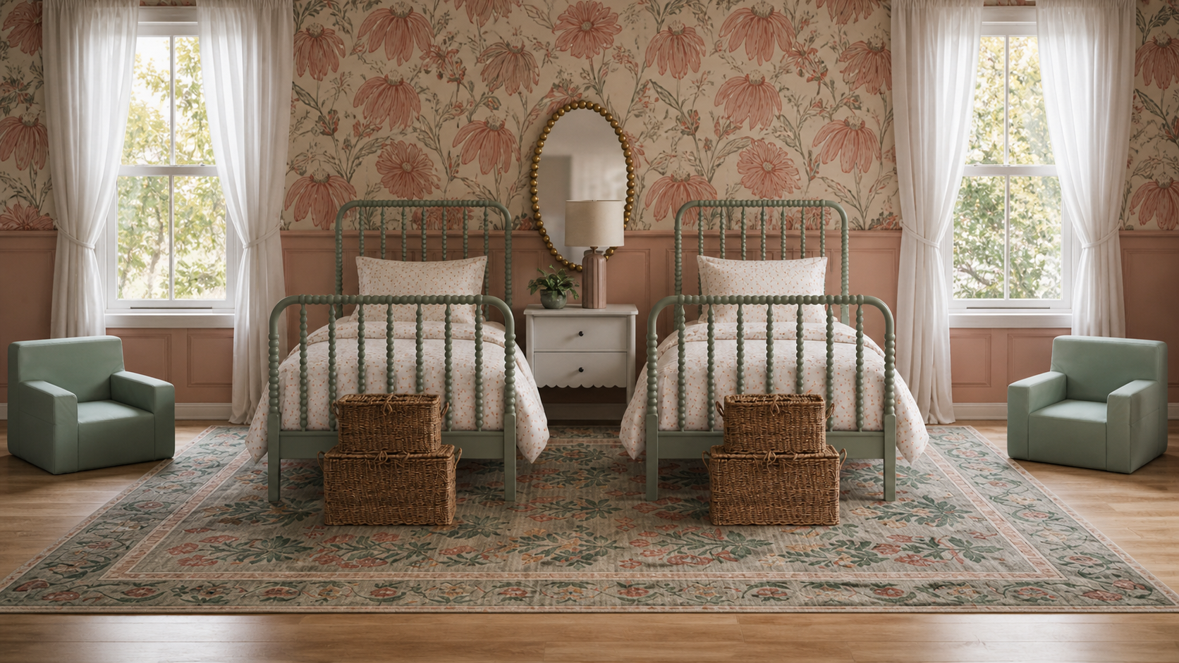
Designing a shared children’s room is such a special opportunity—you’re not just creating a space to sleep, you’re creating a place for imagination, comfort, and everyday moments to unfold.
This twin bedroom strikes that perfect balance between playful and polished, blending soft pastels with bold patterns in a way that feels both joyful and beautifully intentional.
The Wallpaper Moment That Sets the Tone
Let’s start with the star of the show: that oversized floral wallpaper.
The warm peachy tones paired with soft greens instantly bring life into the room. It feels cheerful without being overwhelming—thanks to the scale of the print and the balanced color palette.
Paired with the two-tone wall treatment below, the wallpaper feels grounded rather than busy. This is a great trick if you love patterns but still want the space to feel calm.
Sweet Symmetry with Twin Beds
There’s something so satisfying about a symmetrical layout—especially in a shared room.
The matching mint green spindle beds:
Create visual harmony
Keep the space feeling organized
Add a charming, vintage-inspired touch
The soft green finish ties beautifully into the wallpaper, making everything feel cohesive without being too “matchy.”
A Soft & Playful Color Palette
This room leans into a dreamy palette of:
Peachy corals
Soft sage and mint greens
Warm neutrals
Subtle pops of pattern
It’s playful, but still elevated—meaning it can grow with your child over time.
A Shared Nightstand That Keeps It Practical
Between the beds, a single nightstand keeps things streamlined and functional.
Topped with:
A warm-toned lamp
A touch of greenery
Simple, minimal decor
It’s proof that even in a kid’s space, styling can feel thoughtful and elevated.
Cozy Layers Underfoot
The vintage-inspired rug brings everything together.
It:
Adds softness for playtime
Introduces a subtle pattern
Anchors the furniture layout
The mix of green and warm tones ties directly back to the wallpaper and bedding, creating a cohesive, layered look.
Functional Touches That Still Feel Beautiful
This room doesn’t sacrifice function for style.
Woven baskets at the foot of each bed are perfect for:
Toys
Books
Extra blankets
And those soft, kid-sized chairs? Ideal for reading corners, quiet play, or just lounging.
Light, Airy Window Treatments
Simple white curtains frame the windows, keeping the room feeling bright and fresh.
They balance the boldness of the wallpaper and allow natural light to soften the entire space—something especially important in a room with richer color and pattern.
Why This Room Works
This design is a perfect example of how to:
Use bold wallpaper without overwhelming a space
Create symmetry that feels calm and organized
Balance playful elements with timeless design
It feels fun, but still polished—which is exactly what makes it so special.
How to Recreate This Look
If you’re inspired by this space, focus on these key elements:
A statement wallpaper in a warm, playful print
Matching or coordinating twin beds
A soft, cohesive color palette
A vintage-style rug for warmth and texture
Functional storage, like woven baskets
A few intentional decor pieces (lamp, greenery, simple art)
Final Thoughts
This bedroom is more than just a place to sleep—it’s a space designed for growing, playing, and making memories.
It proves that kids’ rooms can be just as thoughtfully designed as the rest of your home—full of personality, beauty, and warmth.
And honestly? It’s the kind of room you wish you had growing up.
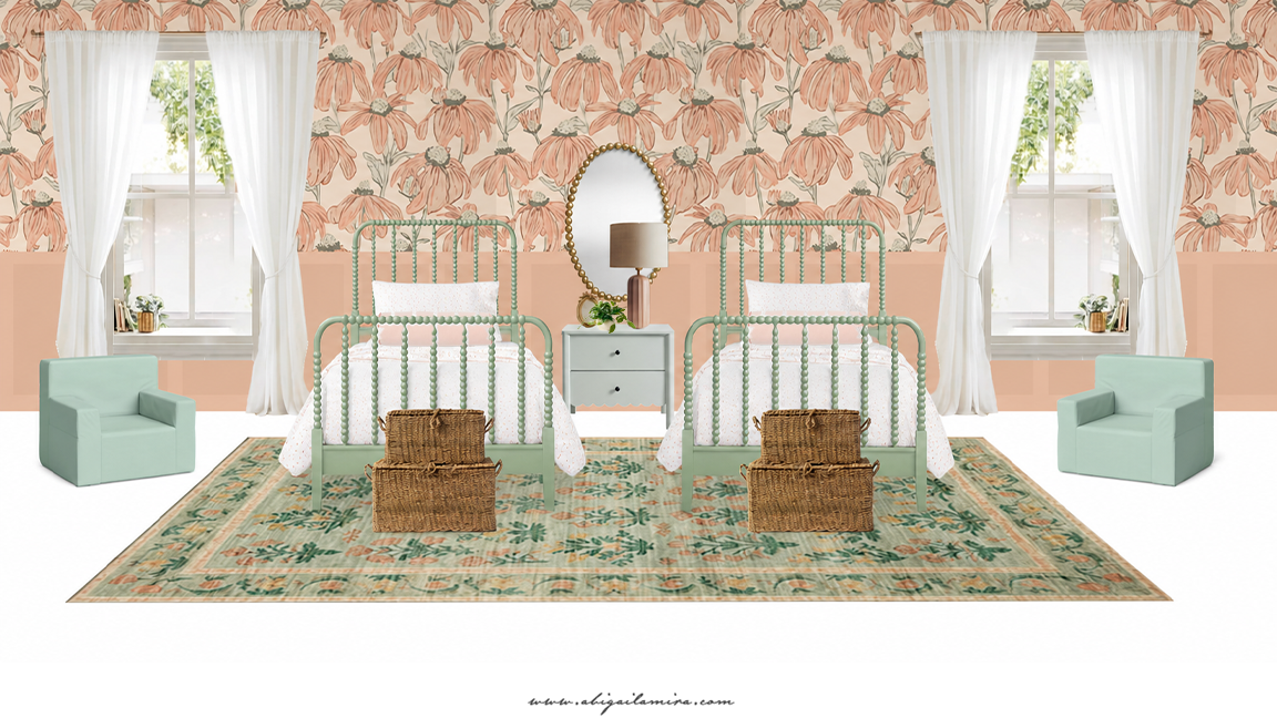
The design
AI Rendering

Get The Look
Please note that this is not a sponsored post; some links may contain affiliate links. If you purchase through one of my links (at no additional cost to you), I may earn a small commission. Thank you so much for your support!
